Presentation Feedback

After presenting my game idea to the class in a short 5 minute presentation, I recieved feedback sheets with opinions on what people approved of, what elements they thought were weak and some general feedback.

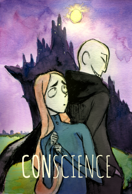
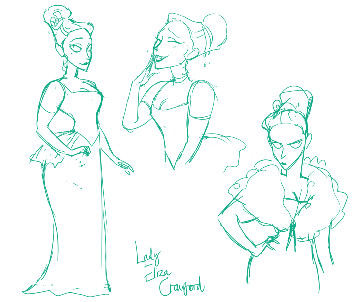
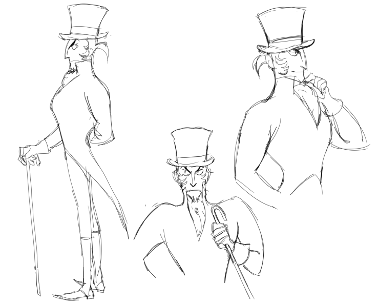
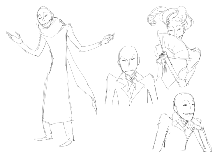
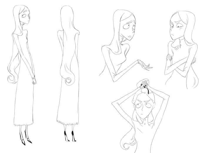
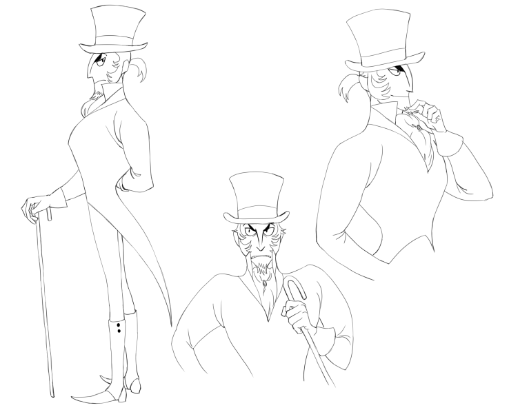
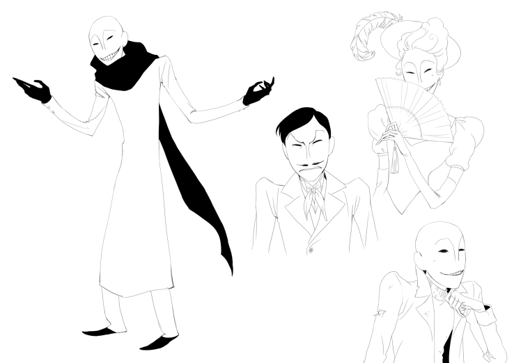
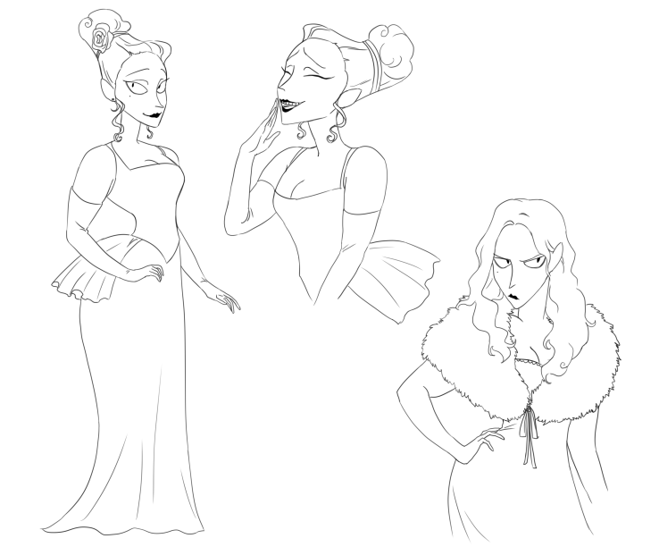
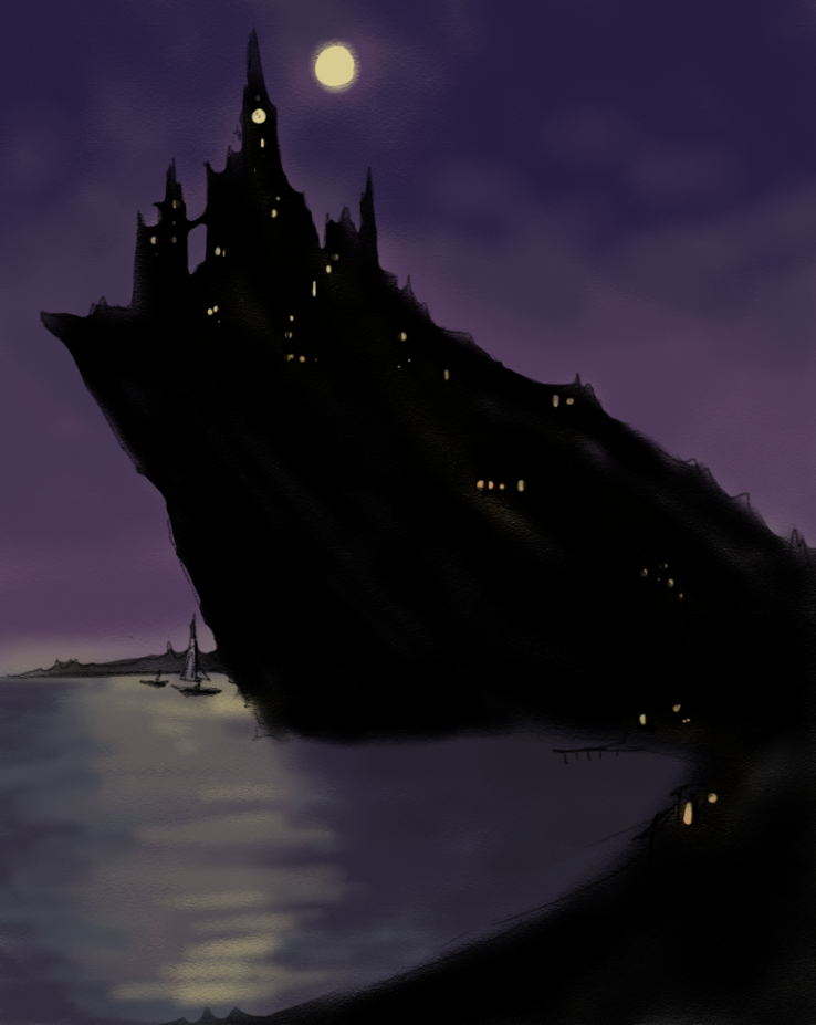
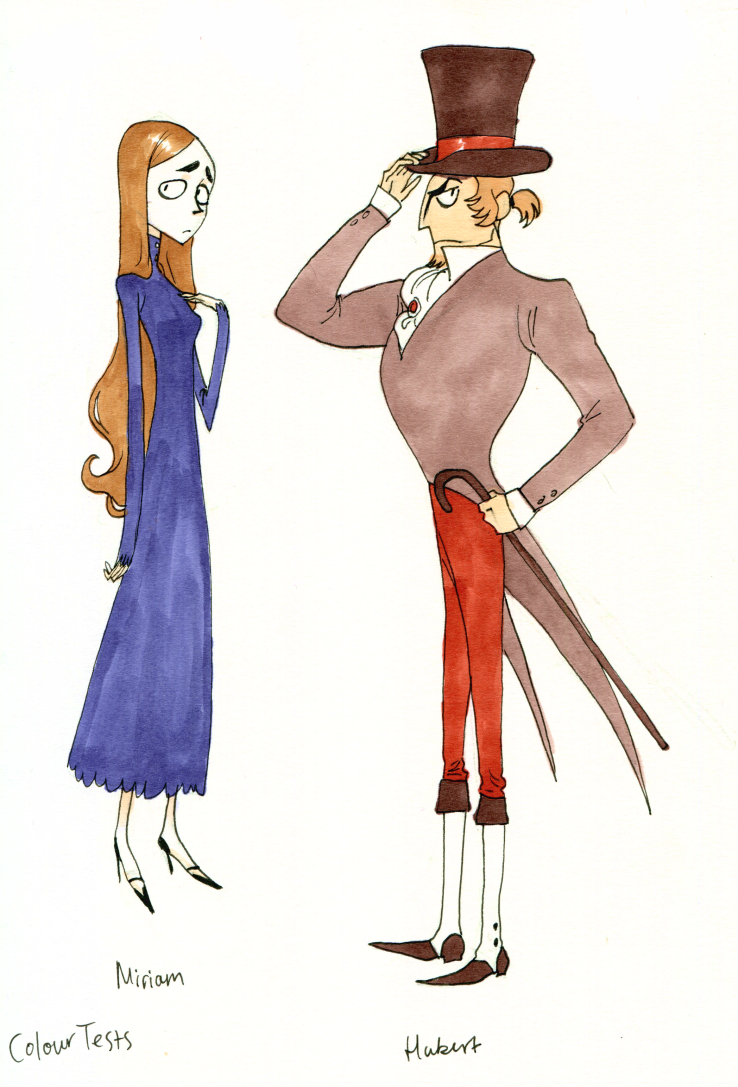
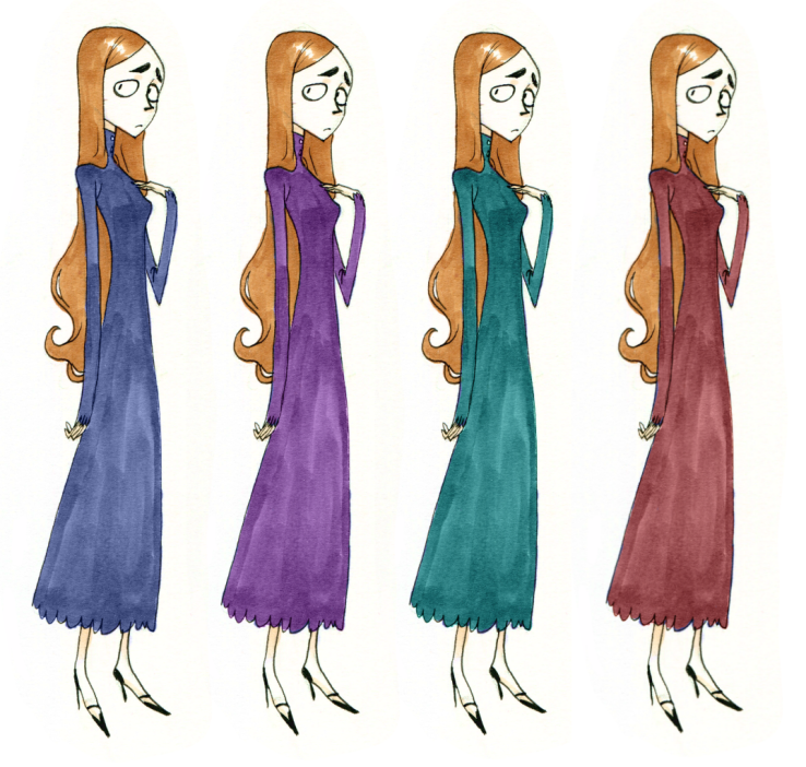
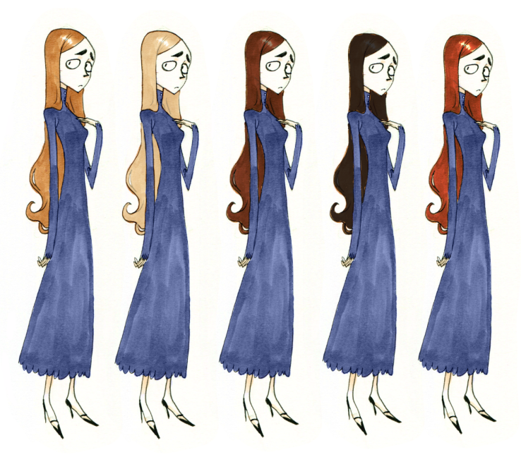
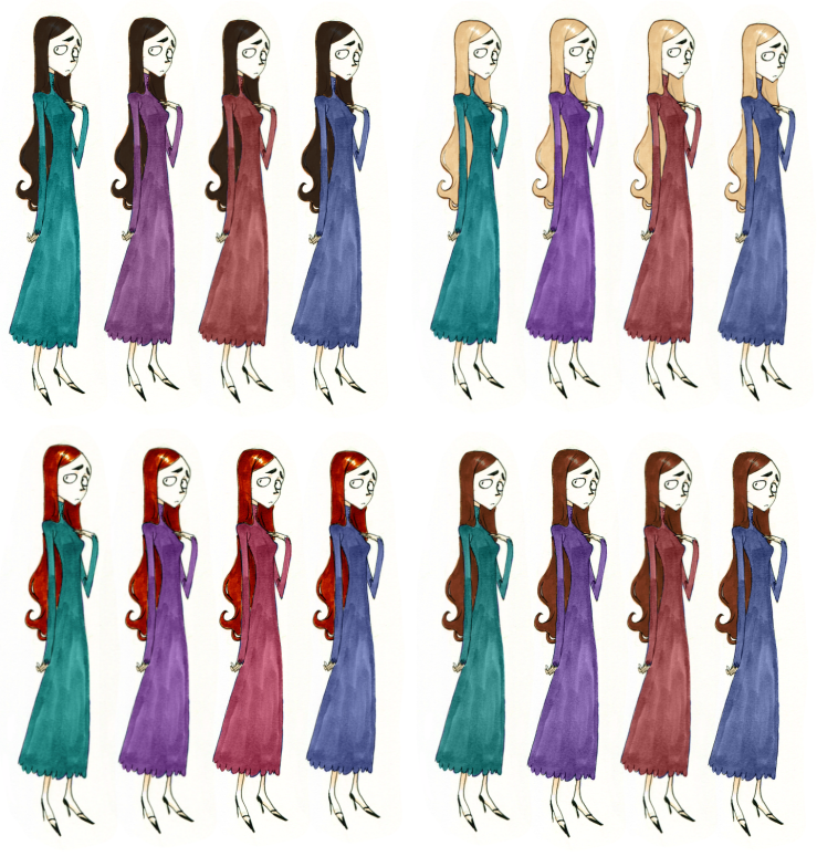
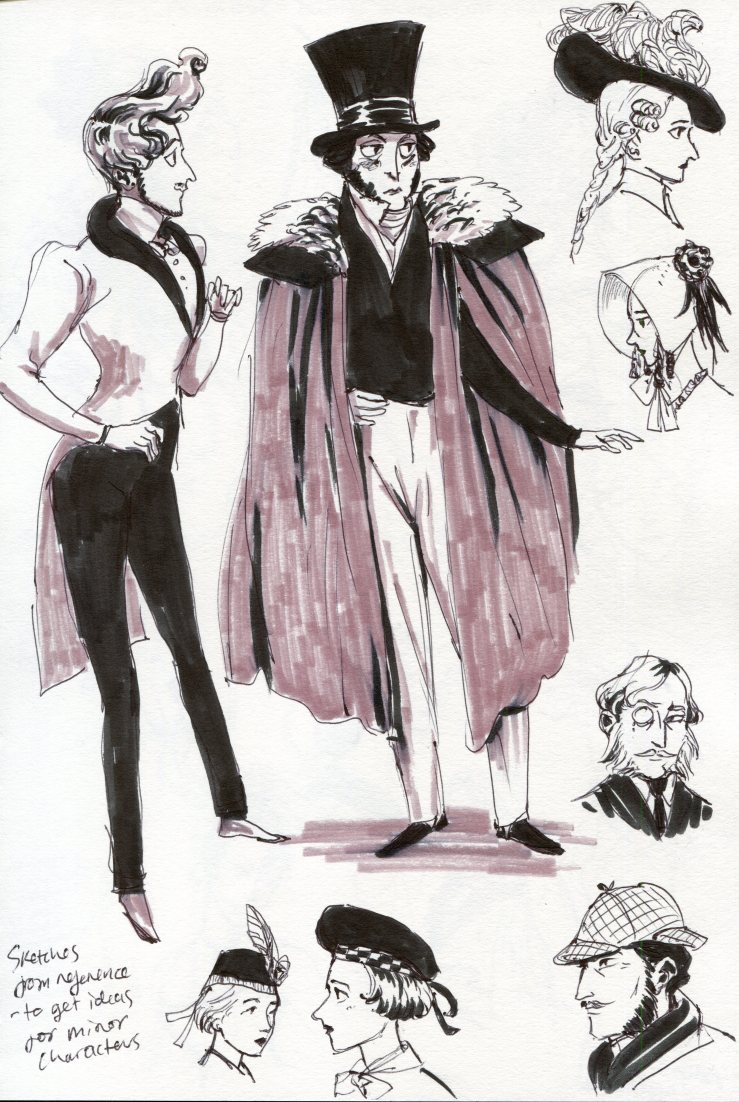
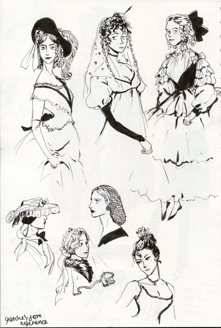
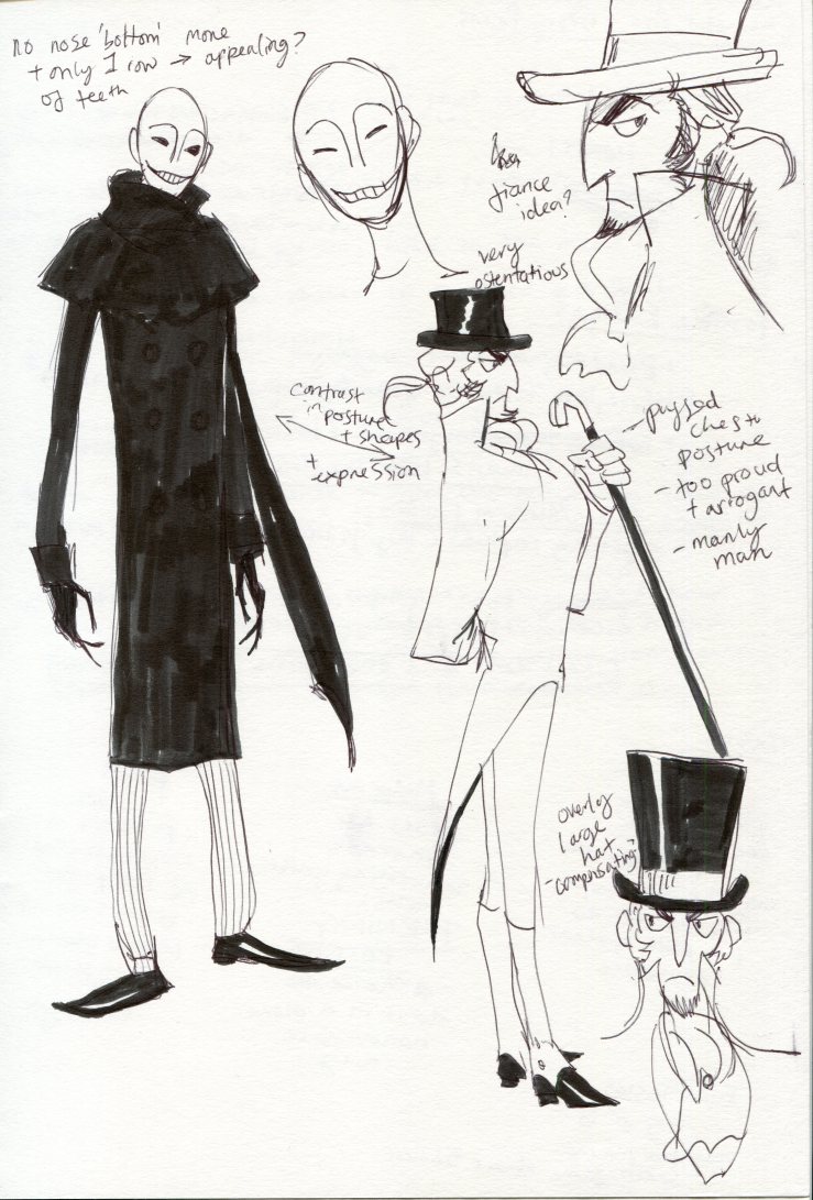
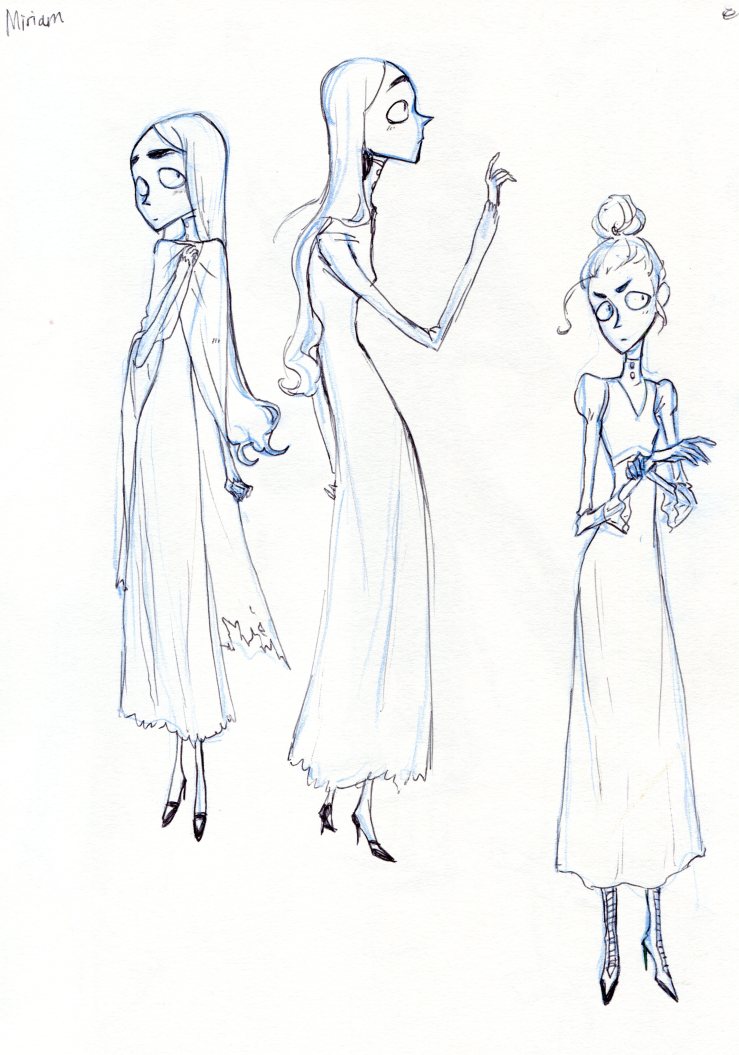
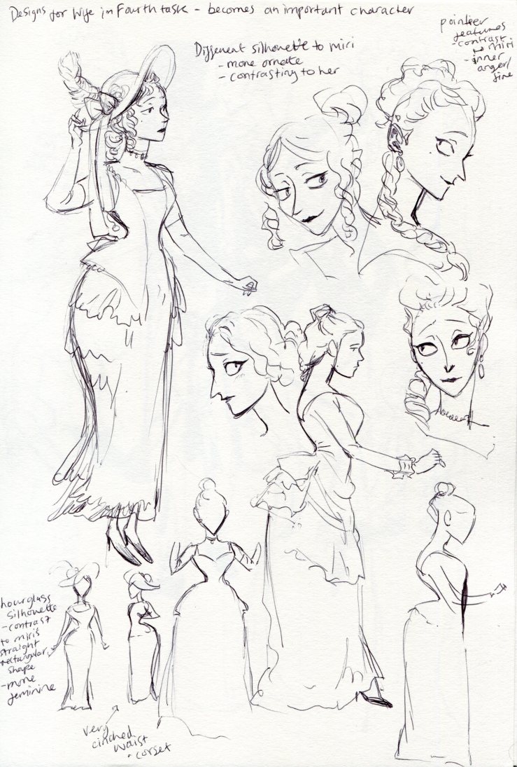
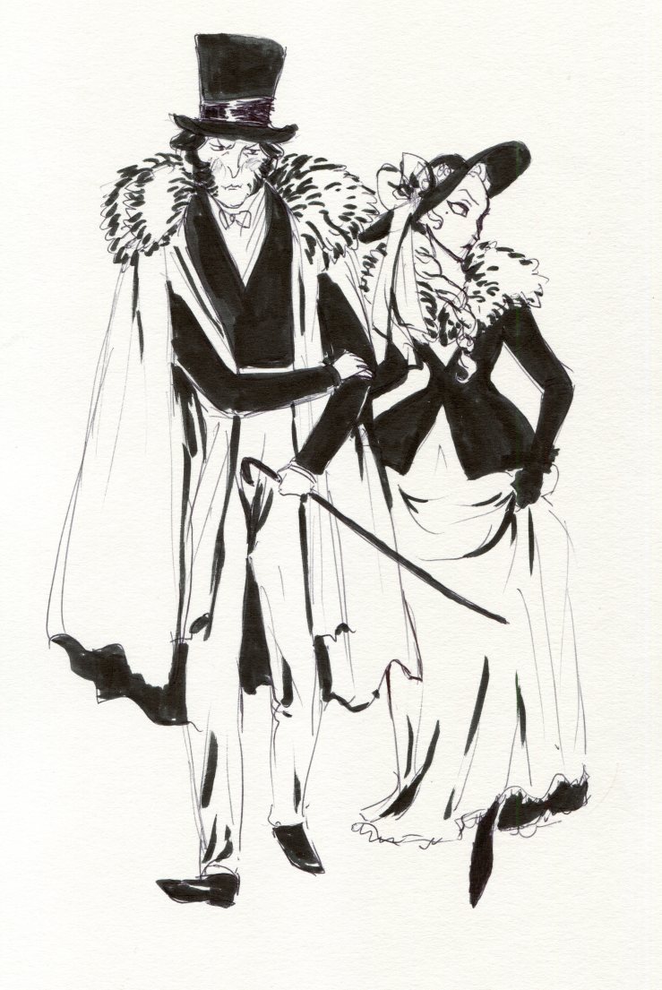
Most people said they liked the art style and thought the characters were unique and interesting. I got a comment saying the silhouettes were strong and they could easily identify the characters, which is great because that is something I strive for when designing characters. Someone also said that the environments mesh well with the characters and that the art style was memorable, which I’m glad to hear.

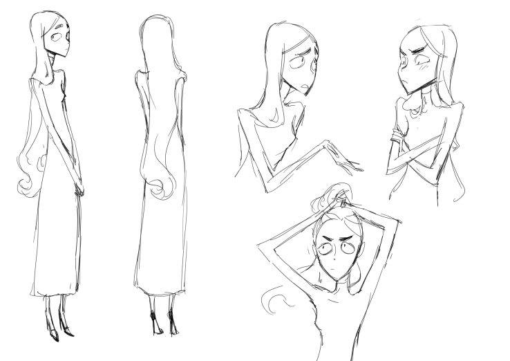
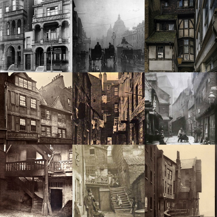
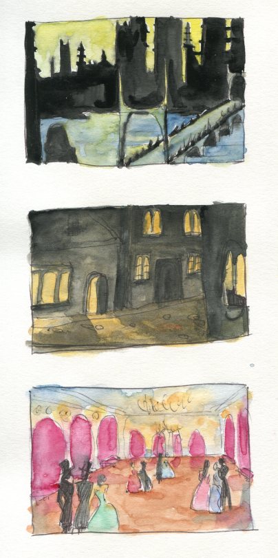
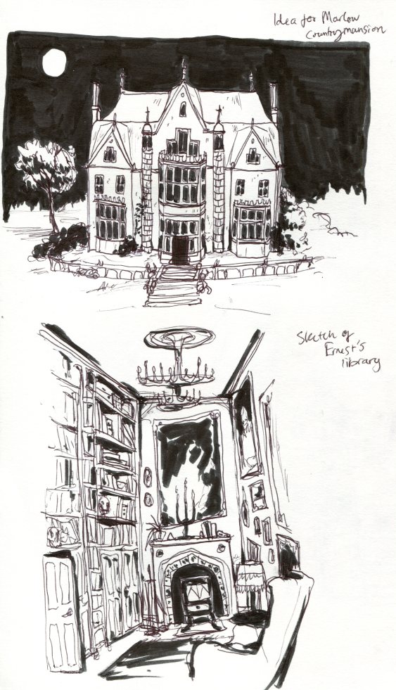
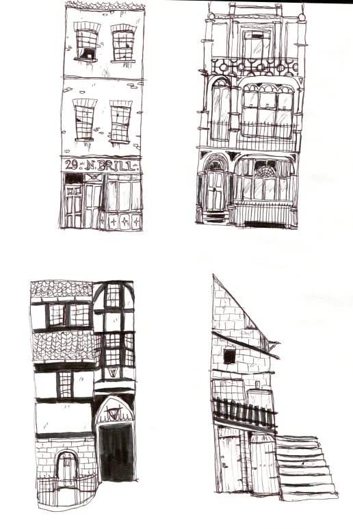
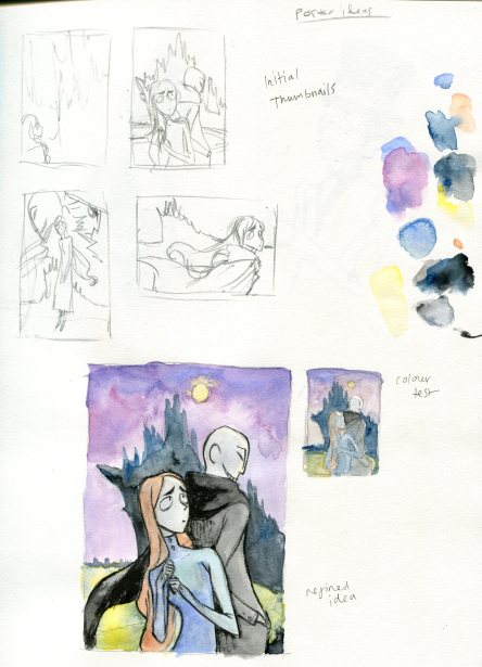
As far as weaker elements, some people said that I should have explained the mechanics more and how the story resolves. I hope that I have explained that well enough in my GDD but I should consider making it more clear in my presentation if I were to give another. A comment was made about how I could have included more environmental work, however considering my focus is character design I didn’t focus too much on environment, but I have painted another painting of the city to furthur show where the game will take place. Hopefully my GDD shows enough images so that viewers can imagine the setting effectively.

Some general feedback was that I should speak louder, so I will try to do that next time I present!

Naming

I made some notes on what kind of names I would like for each character and location. Most of the time, when naming things, I just go with what pops into my head and seems right but I wanted to put a little more thought into the names this time.

img185.jpg

I researched Victorian names and biblical girls names for the main character, I want to reflect her pure nature in her name. I came across the name Miriam which I liked the sound of, it is a biblical name and is quite pure sounding but not too twee like Mary or Eve or Priscilla. I then looked at a family name, I wanted some illiterate just because I think it sounds catchy for a main character. I looked up some posh sounding English surnames than begun with M and tested them with the name Miriam. I liked the sound of Miriam Marlow, posh but not overly extravagant.

The name for the strange man came almost immediately. I wanted something that was ironically honest and trustworthy for his deceptive nature, something that he would have called himself and laughed at secretly. Ernest was an obvious choice, it’s almost exactly ‘earnest’ which means ‘serious and sincere in intention’ which is quite ironic due to his playful and dishonest nature.

For the fiance, I wanted something overly extravagant and fancy sounding, something that overcompensates for perhaps being ‘nouveau riche’. Double-barrel names have always sounded very fancy to me so I decided to combine some English surnames and find a combination that had a good ring to it. I liked the combination of the first name ‘Hubert’ with the surnames ‘Brimsley-Barrington’. I think the illiteration makes it seem like a self-made name, overly composed.

The name for the game itself, I have recently decided, is ‘Conscience’ which I thought was pretty punny being that the game is concerned with honesty and what is right and wrong and also the ‘science’ of the ‘con’.

Inspirational Artists

When I had got an idea of the kind of game I wanted to make I searched online for some artists whose art evoke a similar kind of mood as the one I wanted.


Tim Burton

timburton

I was already imagining a hint of Tim Burton’s style when drawing my initial designs, especially the spindly lines and big, haunted-looking eyes. I don’t want to stray too close to his style though as it’s very recognizable. I will try to make sure my character designs are unique by imbuing my existing art style with influences of these artists.


Gekidan Inu Curry

gekidan

A Japanese design and animation company. I really like the cutout style and how the faces are simplified stylistically. The textures and use of black and white are interesting too. It’s quite a quirky style and I think I could use some aspects of it in my designs, but I would like to keep the characters more expressive and relatable which I think is missing somewhat in this style. It’s kinda surreal and a bit creepy.


John Atkinson Grimshaw

johnatkinsongrimshaw.jpg

I found his art when researching old and abandoned estates on pinterest. I love how he portrays moonlight and creates really atmospheric night scenes with light and silhouette. I’d like to use some of the colour palettes as inspiration for backgrounds for my game. His pieces have quite a creepy and unsettling atmosphere and are quite Gothic which suits my ideas well. The houses are usually the focus of his paintings are interesting and moody portrayals of grand country houses.

Colour Schemes

I wanted to define the colour schemes for my game and its different areas. I have used the Coolors.co website before and found it really useful as it picks colours from images for you and then you can adjust them to get the perfect colour scheme you want. I took my moodboards through the Coolors.co website to see what the overall colours were, I then adjusted them to get a colour scheme I felt reflected the mood I wanted.


Ravensreach City – quite bright due to the warm light, with cool blues to contrast

silohoettee8d1a1-96672a-684b5d-3b5b7b-312e2b


Ernest’s Loft – cosy and warm colours, but quite dark

erneststudy334020-9a171b-78452e-ba8b14-362b17


Ravensreach Streets – these are mainly monochrome photos but I still liked the overall mood created by these colours.

oldhouses4e372f-85674a-5a5a5a-9b8a79-684e27


Marlow Family Manor – I chose the more dull colours from the images, rather unsaturated and dark

mansion44473f-877e6b-5d6171-4a553e-4f2f28


My intial moodboard for the atmosphere I wanted in my game – I really like the green of the John Atkinson Grimshaw painting and would like to use it somewhere in my game.

worldmoodboardfcfdaa-92a96a-835f3f-6d867f-53332d


I think by distilling these moodboards into a few colours, I really got to the essence of the mood and feeling that I wanted and I can use these colours when creating the backgrounds for the final game.

Poster Designs

As w need to produce some image boards for the exhibitition of our game ideas, I wanted to make a final poster that would portray the mood and style of my game in one image.

I looked at some existing game posters (which are kind of hard to find compared to movie posters) I tried to avoid the typical posters of ‘man walking towards or away camera with a gun in silhouette’. The ones I found that I liked are usually quite busy with lots of orange and red and many characters and interesting lighting to highlight the important parts. I found that lots of them do that kind of ‘floating in front of the background thing’ and ‘disembodied heads floating in the sky’ but it feels odd to draw and I’m not sure I’m that keen.

posters.jpg

I sketched some quick thumbnail ideas that focus on Miriam and the city, perhaps with Ernest and Hubert in behind her. I want to show the city as a whole in silhouette to give an idea of the setting and space the game takes place in.

img202.jpg

I chose to refine the thumbnail sketch I thought had the best composition. I used watercolours to get an idea of the colours I wanted. The colours came out lighter when the paint dried so I would use richer, darker colours in the final version. I like the combination of purple and a sort of greeny-yellow. I think I need to add tones of the background colours into the characters to make them look more integrated into the environment and look more cohesive. I used a black brush pen to outline the figure and I think the thicker lines work well to distinguish the characters from the background and make them pop.

img207 - Copy

I refine and coloured a second sketch and I think the colours came out much richer. I used copic markers and the colour are much brighter and richer, but I don’t like the composition that much. I feel like the previous design is more believable, it’s a bit less ‘floaty’ and more focused on Miriam as the main character.


I altered the colours of my preferred sketch in Clip Studio so that it was more accurate to how I wanted it. I added the title and tried a few fonts but I think I like Amatic SC best, it looks almost handwritten and a spindly like the characters and buildings, and a little bit creepy and crooked. I made the CON part of the title bold as I want the wordplay to be evident, but not too over-the-top.

pos1
Poster mockup with Amatic SC font.

Some other fonts I tried. The one on the right is a font I made of my own handwriting a while back I thought it would be interesting to try. The one on the left is CAT Childs, I thought it looked quite Victorian but I don’t know if it fits.


Final Character Sheet Process

I sketched a full body and some expressions of each character. I aimed to get the essence of each character across in body language and the expressions.

mirifinaldesignsketch.png

elizadesignsketchhubertfinaldesignernestfinaldesign


I tested out some brushes to get a look that I liked to use for the linework. I wanted a soft but dense brush to get a nice flowing feel for the lines to emphasise the shapes.

brush choices

The linework for each character sheet.

mirifinaldesignlines.png

hubertfinaldesignlinesernestfinaldesignlines

elizadesignsketches.png


The finished character sheets. After testing out lots of colour combinations for Miriam, I found that I just liked the original colours I picked. I think I do a lot of decision making in my head and I didn’t want to waste time testing the colours for the other characters so I tried a few when making these sheets and picked the colours I think worked best.

mirifinaldesign2.pngelizadesignfinal2hubertfinaldesigncolourernestfinaldesigncolour


Game World Exploration

I wanted the explore some ideas for the world that my game takes place in. I researched some visual inspiration for what I wanted and compiled some moodboards that evoke the feeling I wanted.


Ernest’s Apartment

erneststudy

Key Words: Cluttered, eclectic, dark, enclosed, overwhelming


Marlow Family Manor

mansion

Key Words: Grand, extravagant, foreboding, intimidating, creepy, lonely


Ravensreach Streets

oldhouses

Key Words: Busy, cramped, crooked, overpoplated, maze-like, inhospitable


Some watercolour thumbnail drawings I made to get an idea of how I wanted the scenery to look. I want the focus to be on light and silhouettes and have lots of atmosphere.

img186


Some pen sketches of ideas for important environments in my game.

img189


Sketches of what I would like the houses on the city streets to look like. I want them to all look slightly crooked and wonky.

img188


When I sketched some ideas for a poster I drew the city behind the characters and I liked the shape I used and wanted to explore what the city would look like from afar. I wanted it to have an interesting shape and not look like regular London. I decided that the city should be on a river as a pivotal part of the atmosphere of Victorian London is the river Thames, the fog and mist that rolls up from the river is essential for the typical idea of Victorian London. The harbour is at the bottom of the cliff and poorer areas are more towards the shore where the pollution is strongest as it is filtered down through the streets to the river.

img202
My sketches for a poster design. There is more about my process in the post entitled Poster Designs.

I used Clip Studio Paint to sketch out the silhouette and paint colour behind the city. I used the colours that I had tried out in watercolour but a bit more desaturated and dark. I focused on the lights in the dark silhouette of the city and the moonlight.

ravecty.png

Character Colour Tests

Initially I had some ideas of the colours I wanted for the characters but I wanted to test some other colour options just to see if I liked any other colours better and if they suited the characters more.

colourtest1

I drew a final-ish design for Miriam and Hubert and coloured them using copics in the colours I had imagined in my mind. I wanted Miriam to have a dark dress and I wanted her hair to not be blonde as I thought that might be too innocent looking and typical – almost like Alice in Wonderland. I thought that red or ginger hair would be interesting and might allude to her inner emotions that emerge later in the game which are quite fiery. I thought a brownish colour scheme for Hubert would contrast to Miriam’s blue dress and red to show his agressive attitude. But maybe the red conflicts with Miri’s red hair. So perhaps a more purple-y red for Hubert and a ginger for Miri’s hair.

I adjusted the Hue digitally to see if I liked any of these colours better. I quite like the green dress and darker red hair for Miri.


mirigingerdresses

I tested different colours of her dress with ginger hair. I feel like purple and ginger has Halloween connotation, ginger and green looks like carrots and red and ginger is just…. not good.

mirihaircolourschart

So I tried to change her hair colour and see if any combinations with the different dress colours worked better. I quite like the blonde hair and red dress and the darker red hair with the green dress. I asked the opinion of my brother and he said he liked the ginger hair and blue dress best which was my first choice anyway! So… I might just go with that. Or I might put the characters together and see how they look as a group.

miricolourcombos

More Character Exploration

I made some observational sketches from reference images to get a better idea of how to draw Victorian clothing. I used images of modern fashion inspired by Victorian style and original photographs and illustrations of the time. Some of them I used my imagination and the knowledge I just gained through making observational drawings.

img172

img174

I found a good website focusing on hats. It has a section on the history of hats with illustrations showing the kind of hats people wore in specific time periods. I used this webpage as a resource for getting inspiration.

https://www.villagehatshop.com/content/50/history-of-hats.html

img179img180


Below is the intial brainstorming I did for names for my characters. I defined what I wanted their names to be like and jotted down some ideas. I looked for list of popular names during the Victorian period for the main girl, I came across Miriam and like the sound of it. It is also a biblical name which might add to the honest feel I want.

img185.jpg

I refined the designs for the characters some more. I want Hubert, Miriam’s cruel fiance, to be ostentatious, pompous and self-absorbed. I chose to give him the puffed out chest I saw in lots of the illustrations from the Victorian era.  Ernest’s design is quite simple, I wanted to make his silhouette more unique so I added the shoulder flaps onto his coat. I also changed his face a bit to be more appealing and fit with the other characters, it was a bit too detailed before and looked quite uncanny. I want their to be a lot of contrast between these two men in their body shape and posture, as they have opposing attitudes and demeanors.

img177

img184

Some more sketches of Miriam. The one on the right is what she might look like when she is more confident and resolved. I might even have her cut her hair short after the final task. If she leaves with the wife (below) it would be easier for her to disguise herself as a young man and avoid suspicion.


For the wife of the Baron, I wanted a more ornate and fashionable look. I wanted her to look rich and luxurious but a little uncomfortable, as this would reflect her rich but unhappy life with her husband. I look at various fashion illustrations of the time (seen in my Victorian research post) and experimented with various hairstyles and clothing. I wanted her to be a contrasting shape to Miriam’s silhouette so I gave her a cinched waist and a bustle dress to give her an hourglass shape, which was very much the fashion of the time with extremely tight corsets and huge bustles to accentuate the hips and behind. Her face is also pointier and more elegant than Miri’s to contrast and hint at her inner fiery nature.

img181

A sketch of her and her husband together. They are not very fond of each other and she especially dislikes having to be near him as he is often abusive to her. He controls every aspect of her life and I wanted to show that in his possesive grasp on her hand.

img183


Victorian Slang and Phrases – Research

As I will have to write dialogue for my game I wanted to research how Victorians spoke to add a bit more flavour to the dialogue. I think the way people speak shows a lot about them and their personality.

I looked at cockney rhyming slang which I think is a really interesting quirky and silly human thing to do. Why make up all these longer phrases for shorter words? For fun, I guess.

469c3618241f0860ce3ea8af2fcbe37a

Cockney-Rhyming-Slang-Metal-Sign-Nostalgic-Vintage-Retro-Advertising-Enamel-Wall-Plaque-200mm-x-150mm
Some examples of cockney rhyming slang.

Next I looked for Victorian slang and found this article. I like how most of the time you can source the slang back to it’s origins.

http://mentalfloss.com/article/53529/56-delightful-victorian-slang-terms-you-should-be-using

Some of my favourites…

slang10

slang9

slang8

slang7

slang6

slang5

slang4

slang3

slang2

slang1

Also, whilst googling I found these Victorian versions of memes that I thought were pretty funny….

tumblr_lqf0wtQvVR1qfdyfzo1_500

719d2c3fead32f838a8df2e30f49b101--victorian-fashion-victorian-era

5fb488ba548e378006e0e2de1f5fd613--very-funny-pictures-funny-photos


And whilst stumbling across Victorian style memes of our age, I came across an article about some genuine Victorian memes.

My two favourites… I think they could be some sentence enhancers when I write some dialogue for my game.

meme1

meme2